Website redesign cut drop-off by 18% and drove a 50% surge in donations, just weeks after Lazarev.agency stepped in.
Serhiy Prytula Charity Foundation, one of Ukraine’s most recognized humanitarian organizations, partnered with Lazarev.agency to tackle a digital bottleneck that was limiting fundraising growth. Just one month after launching the redesigned platform, the Foundation saw a 50% surge in donations and an 18% reduction in user drop-off during the donation process.
Practical design to keep up with the mission
Prytula Foundation plays a critical role in supporting defense, recovery, and humanitarian efforts across Ukraine. However, its digital platform wasn’t keeping pace with the urgency of its mission. Visitors struggled with unintuitive navigation, clunky donation flows, and poor accessibility.
In the context of an ongoing war and humanitarian crisis, these digital inefficiencies were not just inconvenient but costly.
4 design wins for Prytula Foundation
Lazarev.agency approached the challenge with a product design strategy rooted in empathy and speed. The goal was to make contributing feel intuitive, meaningful, and rewarding.
Key design improvements included:
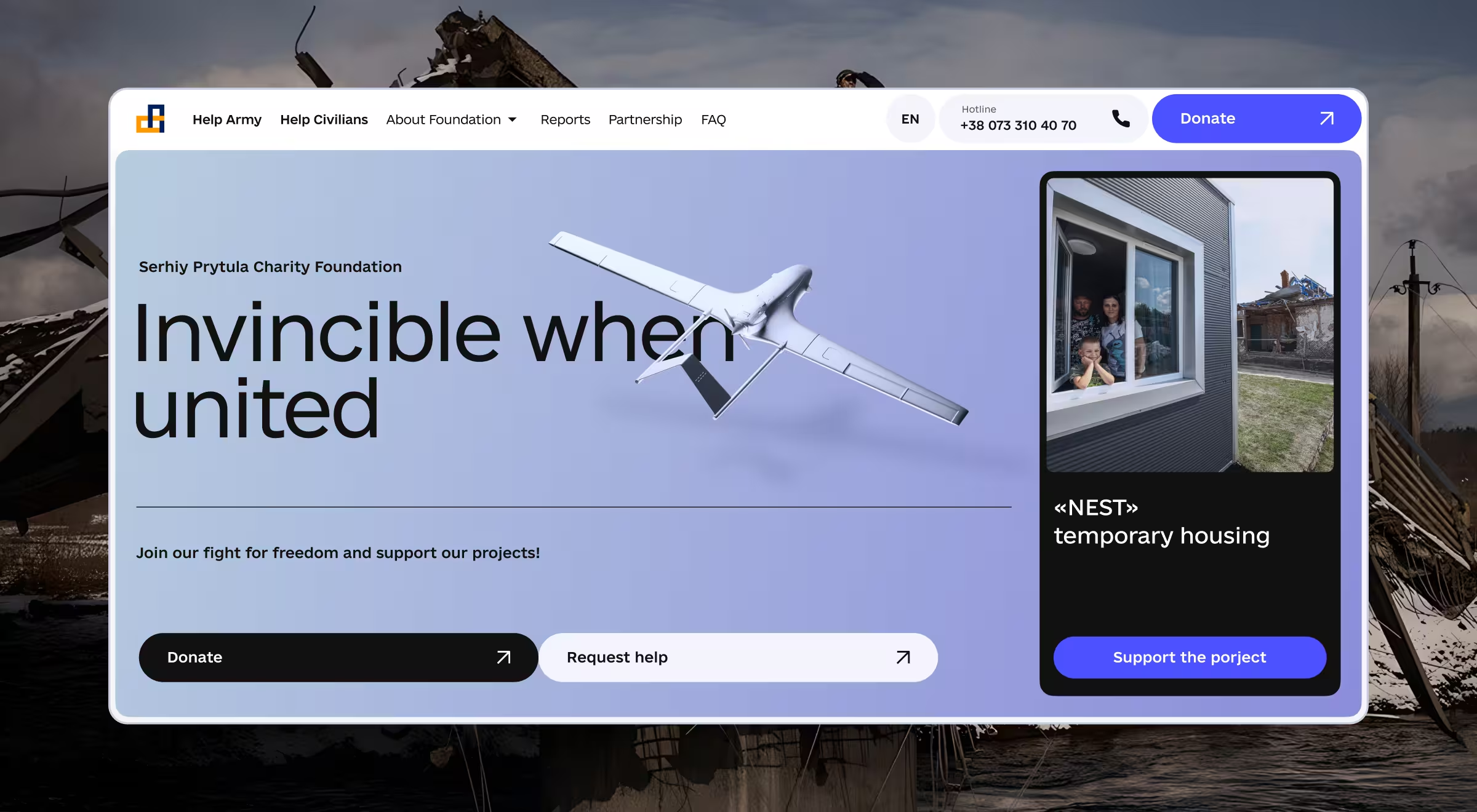
- Modernized visual identity: The redesigned homepage features a 3D model of a drone people donated for, bold CTAs to donate or apply for support, and the Foundation’s current charity projects.
- Accessibility first: The new design supports smooth interactions across devices, ensuring everyone can navigate the site and donate with ease.
- Simplified donation process: We redesigned both the donation and humanitarian aid request forms to minimize steps, reduce confusion, and encourage completion. Plus, our team integrated a toggle switch, which adjusts currencies (USD, UAH, EUR) based on the visitor’s location.
- Partnership webpage revamp: Lazarev.agency redesigned the Partnership webpage for simplicity and intuitive layout to encourage corporate players to collaborate with the organization.
“When designing for organizations like the Prytula Foundation, clarity and trust are everything. Every click needs to feel purposeful, every moment frictionless.”
{{Oleksandr Koshytskyi}}
Contributing to the cause made frictionless
The new platform dramatically reduced complexity. Donors can now choose an initiative, set an amount, and send their contribution in seconds.
And the results came fast. Within the first month of the website redesign launch, the Foundation saw:
- Increased contributions: A 50% increase in charitable contributions.
- Improved customer retention: An 18% reduction in drop-off during the donation flow.
- Responsive design: Significantly improved user experience across all devices.
- Donation flexibility: Multi-currency, multi-platform donations enabled (PayPal, crypto, etc.).
- Industry recognition: In 2023, the redesigned website became a Red Dot Award Winner for outstanding design in the “Brand and Communication Design” category.
The revamp didn’t just modify the site’s visual design. It changed how people contributed to the cause, how quickly campaigns were funded, and how far support could reach.
Humanitarian aid needs human-centered design
Prytula Foundation’s case study demonstrates that strong missions need equally strong digital tools. Lazarev.agency’s redesign helped transform moments of donor intent into real-world outcomes. It’s a powerful reminder that great design is a strategic tool driving real-world impact.



.webp)