
Thoughtful product design turns an early-stage education startup into a teacher-favorite platform adopted across schools.
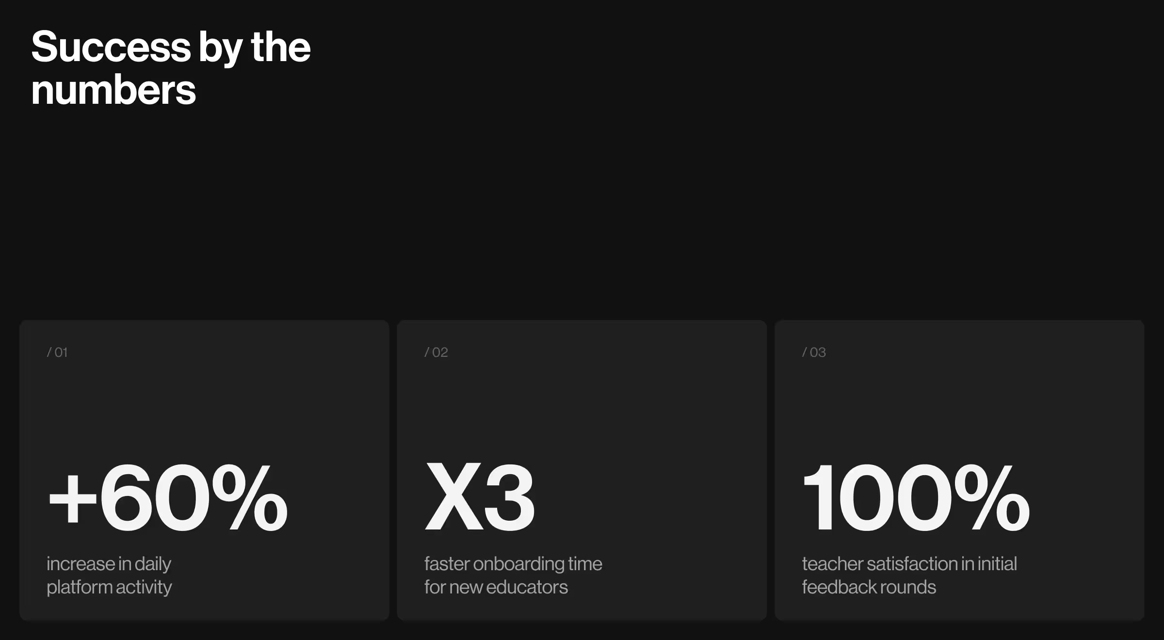
GAIN, a mission-driven edtech startup focused on helping teachers guide students through step-by-step learning journeys, partnered with Lazarev.agency to turn raw ideas into a fully functioning product. Just weeks after launching the redesigned platform, GAIN saw a 60% increase in daily user activity and faster onboarding across schools.
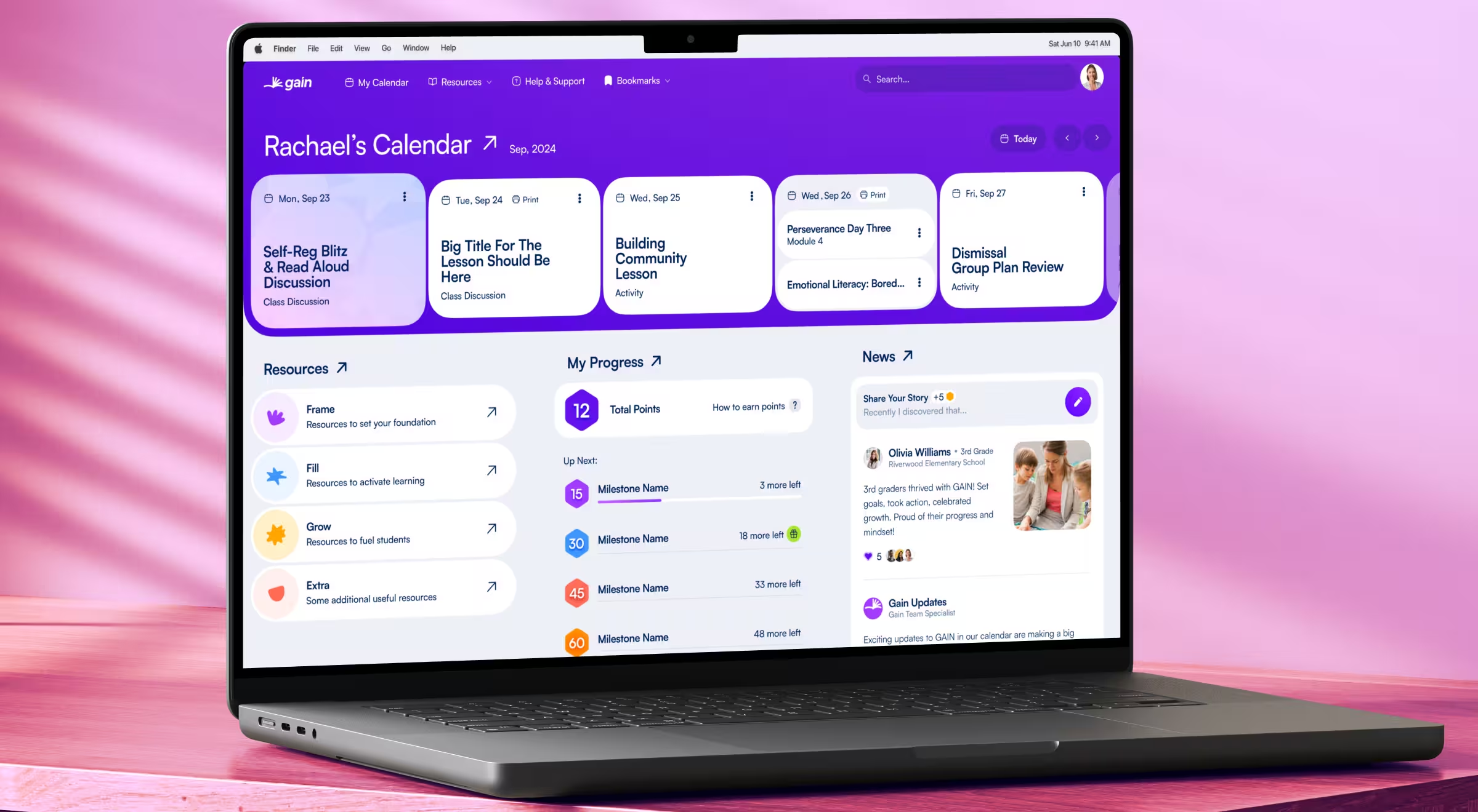
Product design to support real classrooms
GAIN set out to fill a gap in the edtech space: a learning platform that actually reflects how teachers teach and how students learn. At the time, however, the idea lived mostly on paper, scattered admin tables, low-fidelity screens, and no structured system to support core user flows.
Before launching their MVP, GAIN teamed up with Lazarev.agency to bring the concept to life. The goal was to deliver a scalable, intuitive product experience that empowers educators without overwhelming them.
UX that thinks like a teacher
Rather than layering features onto a rigid platform, we approached GAIN’s UX architecture from a teacher’s perspective. What would reduce mental load during a busy day? What workflows need to feel instant? How can learning progress feel structured, not static? We designed a flexible, modular system that mirrors real-life teaching dynamics:
- A progressive learning journey builder that guides lesson planning and student tracking
- Role-based admin tools with smart controls for teachers, school leaders, and super admins
- Clean dashboards focused on what matters most: students, tasks, and classroom flow
Each element was stripped down to serve a single purpose: eliminate friction and keep teachers focused on teaching.
A visual system to communicate calm
Many platforms clutter interfaces with badges, tooltips, and distracting noise. We went the other direction. GAIN’s visual system was designed to feel breathable, optimistic, and highly functional.
- Soft color palette inspired by classroom calm
- Subtle animations that guide
- Consistent iconography and spacing for low-cognitive-load navigation
- Mobile-optimized layouts that support use across devices, from tablets to laptops
“Teachers don’t have time to learn how to use a product, it needs to work intuitively from day one. Our job was to make every screen self-explanatory, every click meaningful.”
{{Oleksandr Koshytskyi}}
Product design powers purpose
GAIN’s story is a reminder that great design is about removing the noise so that purpose shines through. By building around real educator workflows and emotional clarity, GAIN turned a fragile MVP into a high-impact learning platform adopted across schools. And for early-stage edtech teams? It’s proof that EdTech UX design is the growth engine.



.webp)