A user opens your AdTech platform. No hesitation. No hunting for the next step. The flow feels obvious like the product was built around their instincts, not the other way around. Every element earns its place. Every interaction moves them forward.
That’s not luck. That’s UX/UI doing its job. In this guide, we break down how Lazarev.agency designs AdTech products that feel this seamless — products that pull users in, keep them engaged, and make leaving feel like the wrong choice.
Key Takeaways
- A single poor brand experience is all it takes for most users to switch tabs.
- Most users make their impression of your website based on its design; more so, the judgment happens quickly and is hard to beat.
- Intuitive UI is the outcome of simplicity and functionality merging.
Why UI/UX Design of Your AdTech Product Matters More Than Ever
In 2025, two powerful industry forces drive AdTech product UX/UI design: explosive market growth and sharp user expectations. The market is booming and expected to hit $1,560.86 billion by 2030, growing at a remarkable annual rate of 14.4% starting in 2025. And with user expectations as high as ever, one poor brand interaction is enough to make customers walk away.
With scarce user attention and fierce competition, striking a chord with your audience through meaningful experiences is one of the best (if not the only) ways to stand out. If something feels off, users won’t hesitate to leave. Here’s why taking AdTech web design seriously makes a difference:
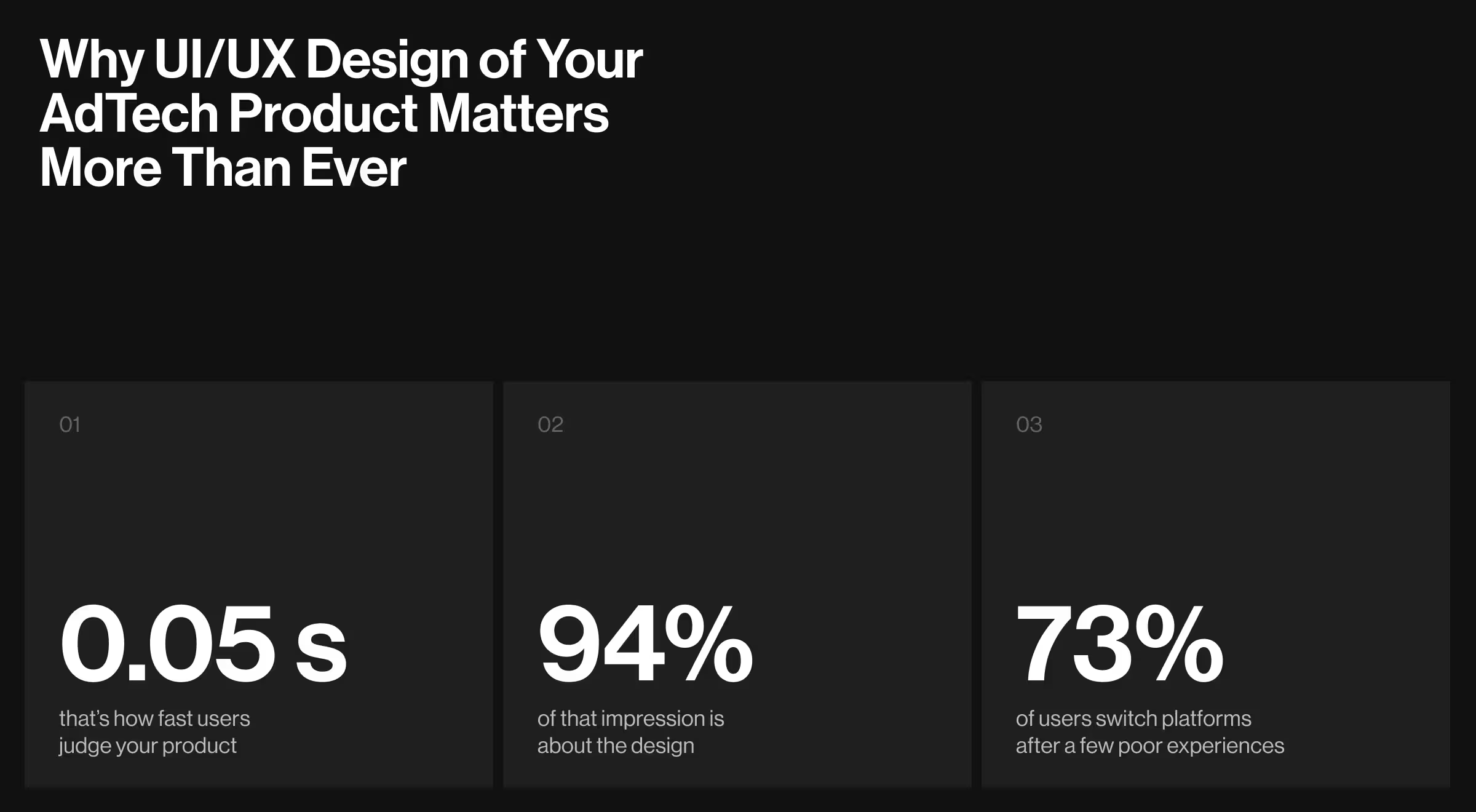
- First impression matters: Research shows that it takes around 0.05 seconds to form an impression of something. The same goes for users deciding how they feel about their interaction with the platform. What’s more, nearly 94% of such impressions evolve around the platform’s design.
- Users aren’t lazy – they have options: Confronted with countless alternatives competing for their limited time and attention, users won’t settle for mediocracy. If the experience hasn’t been right a few times, 73% of customers will switch to a competitor for good.
“You don’t lose users because the product is bad. You lose them because it demands too much. The moment it takes effort, they’re gone.
{{Oleksandr Koshytskyi}}
Well-crafted user experience design pays off by:
- Turning user attention into retention
- Improving brand loyalty
- Reducing friction and building trust
- Bringing value to the user
UX Strategies that Drive Conversion: Cases by Lazarev.agency
A great AdTech UX design doesn’t have to be overwhelming. Drawing on Lazarev.agency’s practical expertise, the following AdTech design solutions have proved to guide digital products toward success:
Solution 1. Strive for Optimal Personalization
Navigating intricate AdTech products often leads to decision fatigue and cognitive overload. Until the smart UX design steps in to shift the focus toward personalization and control.
That’s exactly what we delivered for Blockbeat, a leading crypto news aggregator and trading terminal. We revamped the platform’s block layout and introduced advanced filtering options to personalize the user's news feed.
Our personalization efforts didn’t stop there. To support active traders, we developed customizable watchlists aligned with individual preferences. Plus, we implemented a responsive market stats widget to let traders grasp market sentiment swiftly and make well-informed decisions.

Solution 2. Identify Points of Friction and Fix Them
Designing a product that runs smoothly helps with user retention. That’s why addressing the pitfalls of your product’s AdTech web design is crucial for averting user disengagement and improving conversion.
That’s the strategy Lazarev.agency took for a global fintech company. While the platform’s existing architecture was highly functional, users found it challenging to navigate.
“When users struggle, they don’t blame the interface. They blame the brand. That’s the hidden cost of poor UX.”
{{Oleksandr Koshytskyi}}
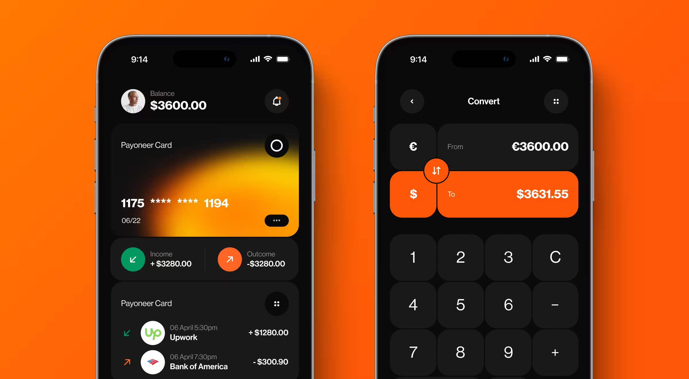
Upon a detailed audit, we identified that the company's existing home screen wasn’t utilized to its full potential. We enhanced the user flow by ensuring the home screen delivered immediate value. The restructured home screen now houses the user’s balances, currency options, and a built-in calculator all in one place.
With Users and Simplicity in Mind: Practical Insights by Lazarev.agency
The quality of user experience reflects the effectiveness of your AdTech UI design strategy. Below are the two key principles that have consistently delivered results.
Step 1. Integrate User-centric UI Solutions
This principle guided our collaboration with Matta, a marketplace designed to manage the entire lifecycle of chemical and raw material supply across the African markets.
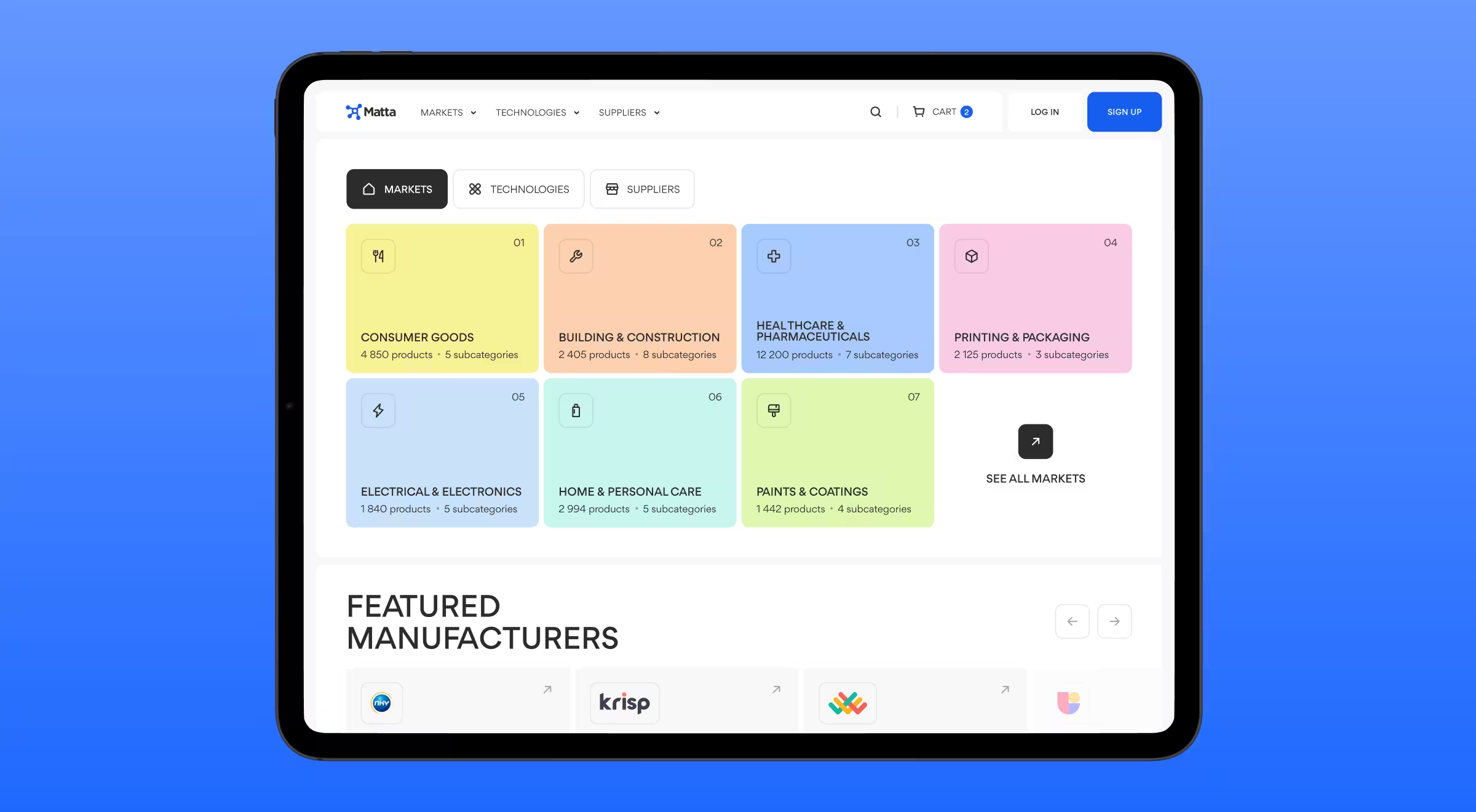
After brainstorming sessions with the Matta team, we aligned on a shared vision: a transparent, highly intuitive platform where buyers and suppliers can search, compare, and transact.
To bring this vision to life, we redesigned the informational architecture of the homepage to ensure users could explore the products effortlessly.
Key enhancements included:
- A search bar for targeted queries
- Category-switching option for easy product browsing
- A display of popular subcategories directly beneath the search bar
- Adjustable quantity inputs with automatic calculation of the total price
- A sample ordering feature to drive user confidence and boost conversion
Step 2. Don’t Underestimate the Power of Simplicity
Intuitive navigation happens when simplicity meets functionality. That’s what we did to our analytics platform client.
While the goal of this business is to offer data-driven metrics for e-commerce brands, the complexity of the platform risks overwhelming its users. Our redesign focused on simplifying the user interface without compromising functionality.
Our team embraced a minimalistic design that aligned with the client’s vision. Then, we integrated responsive widgets, intuitive dashboards, and intricate tables to accommodate vast sets of data. As a critical touch, we added smart notifications to help users analyze the metrics of their business.
🔍 Pro Tip: Assess each aspect of your digital product. Ask yourself: ”Does it facilitate or hinder user flow?” Ensure the information architecture of the homepage makes sense and all the dashboards feel intuitive.
Let's Build a Product Design That Works
The right UX/UI design that integrates key AdTech solutions is a shortcut to business success. Yet, creating a smart digital product design that keeps users engaged is a matter of strategy, research, knowledge, and leading expertise.
Want to design a product that converts real results? Contact us today to discuss your project. Share your vision, and we’ll help you turn it into a design strategy that works.



.webp)